Brand Guidelines
How Adrian Viewpoint looks: the name, the mark, the colours, the type and the imagery, and what keeps them consistent wherever they appear.
Name and wordmark
In text, the name is two words: Adrian Viewpoint. The wordmark sets it as one, in extra-bold, widely spaced capitals. “Adrian” takes the darkest colour of the background it sits on and “Viewpoint” the brand's burgundy; on a dark background, “Adrian” turns white and “Viewpoint” a lighter red, so both stay legible.
The tagline:
Geek Out on Code. Master Your Money. Build the Future.
The mark
The initials, for the places the wordmark doesn't fit: the browser tab, app icons, avatars. An “A” in burgundy beside a “V” in slate; on a dark background they lighten to beige and grey.
Colour
Five brand colours. Burgundy carries the brand; the others support it.
Burgundy
The brand's accent: main actions, links, headings and the wordmark's “Viewpoint”.
Charcoal
The wordmark's “Adrian”, and text that needs the most weight.
Slate
The mark's “V”, subheadings and supporting text.
Beige
Decorative only. Small grey text on it falls short of accessible contrast, so it never sits behind body text.
Grey
The neutral the interface's warm greys are built around.
Around them, the interface uses shades of burgundy and of a warm grey for surfaces, borders and text, all checked for accessible contrast: an off-white page, white panels, near-black text. Green, blue, red and amber are kept for meaning (success, information, errors and warnings) and for the article categories.
Type
The reader's own system typeface: San Francisco on Apple devices, Segoe UI on Windows, Roboto on Android. It's familiar, sharp at every size, and there's no font to download. Hierarchy comes from size and weight; page titles and section headings are burgundy, subheadings charcoal.
Page title
Section heading
Subheading
Body text sits in near-black on white, at a comfortable size for reading long articles.
Captions and details, such as a reading time, in a quieter grey.
Imagery
Every article has a cover drawn from the brand colours, in the language of the home page's banner: a near-black field and a burgundy glow. On it, two layers: the category's pattern, and on top, emblems that the article's own title, description and tags call up. Nobody has to make a cover, and no two are the same.
The category patterns
The base of every cover in a category, dimmed under the emblems. An article whose words call up no emblem shows its pattern alone, like this.
The emblems
Each emblem stands for an idea, and comes up when an article uses one of its words, in the title most of all. The strongest match leads; a second one can join it, smaller. A few of them, with their words:
Drawing a new emblem
- One idea, from simple geometric shapes, filling a square.
- Lines in beige, all about the same weight.
- One part in burgundy: the point of the drawing.
- Near-black fills where a shape should hide the pattern behind it.
- No text, no people, no logos.
On a card, on a shared link
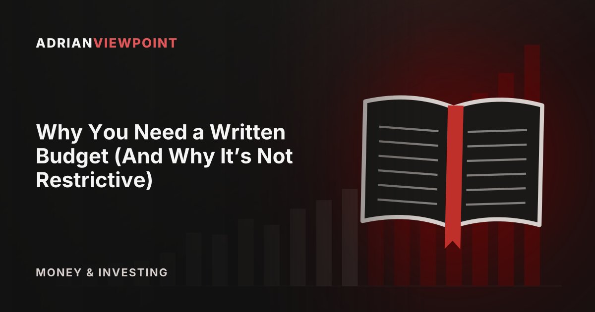
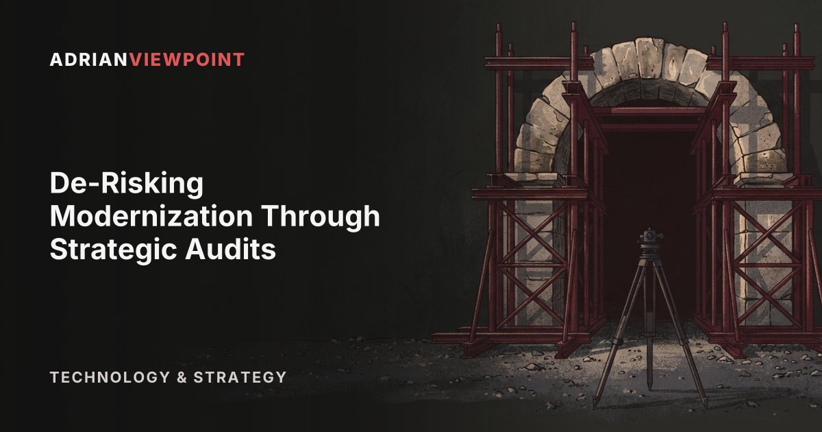
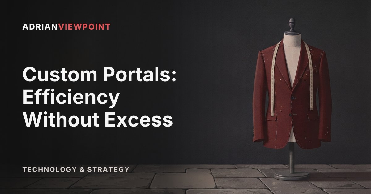
Cards and article pages carry no text over the cover, so the emblems sit in the centre. A shared link carries the title: the emblems move to the right, and the wordmark, the title and the category take the left, in Inter, the open typeface nearest the system type the site uses.
Illustrations
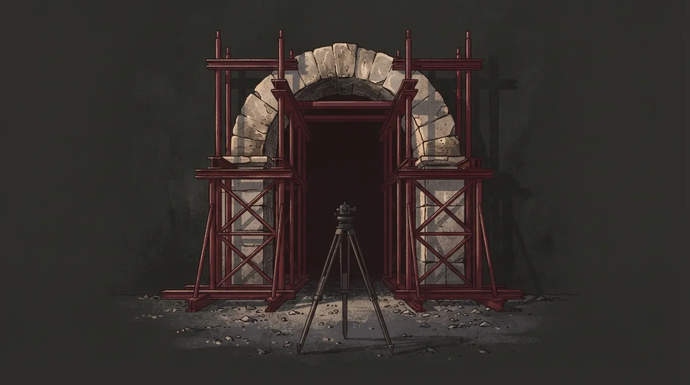
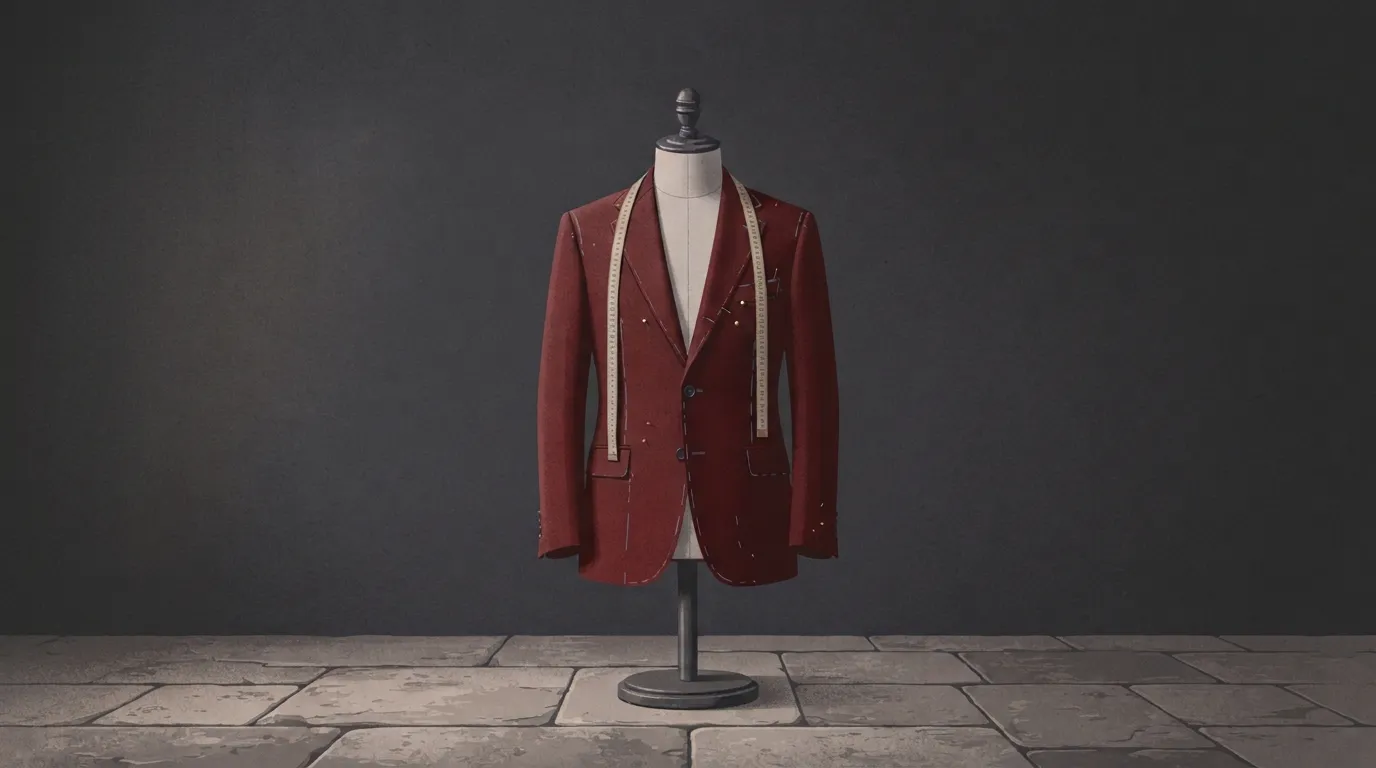
An article that will be promoted, and whose idea one object can stand for, can have an illustration in place of its cover. Every illustration follows the same recipe, so it sits beside the covers as one family.
- Palette
- Charcoal, burgundy, slate and beige, nothing else.
- Background
- Deep charcoal, like the covers.
- Subject
- One real structure or object that stands for the article's idea, at human scale, on textured ground, filling about half the frame's height. Burgundy for what's new or chosen, against older, neutral materials. A concrete thing, never a visual trick such as a shadow that forms another shape, and a scene of its own rather than the article's emblem redrawn.
- Light
- Soft light over the whole scene, warmer from the left, with soft shadows. No beams, streaks, rays, spotlights or glowing doorways.
- Style
- Matte editorial illustration with fine grain, the same for every article.
- Frame
- Two versions, like the covers: the subject centred in 16:9, for cards and article pages; and the subject on the right with the left half empty in 1.91:1, for shared links, where the title goes.
- Never
- Gold, neon or blue glow; people at desks, laptops, screens or offices; text or logos.
Each illustration is made twice: centred, for the card and the article's page, and with the subject on the right, for the shared link, where the title takes the left.
The fox belongs to BudgetFox, Adrian's budgeting app, and to BudgetFox's own art. It never appears in the blog's covers or illustrations.
Interface
Main actions are solid burgundy and the others outlined in it. Each article category has its own colour.